

goldwoven
Feb 26, 2026
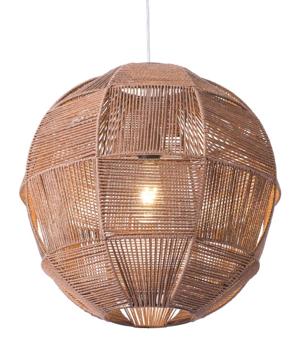
Gold Woven Chandelier: A Calm Showpiece for Modern Homes
Around 7:30 p.m., a room stops pretending. Daylight fades, the TV throws a blue cast, and any “too sharp” ceiling light suddenly feels loud. In that moment, a Gold Woven Chandelier earns its keep because the shade itself does half the work—diffusing glare, warming the ceiling, and adding texture that looks intentional even on a plain white paint job. Here’s the part that often surprises people: the best showpiece lighting doesn’t scream. It settles the space. That’s why a well-chosen Chandelier can act like a quiet centerpiece in a modern home without turning the room into a theme.
The real advantage of woven light in modern interiors
Modern rooms love clean lines. However, clean lines can feel a bit sterile after dark. A woven shade fixes that in a very specific way: it breaks light into tiny, soft fragments instead of blasting it in one hard beam. Even with the same LED bulb, the room feels calmer because the eyes don’t fight glare as much.
In real homes, the ceiling is usually the flattest surface around. So, texture up high matters more than expected. A woven chandelier creates micro-shadows—little stripes and lattices that drift across the ceiling when someone walks by or when a door swings open. That movement makes the room feel “alive,” especially at night when everything else is still.
There’s also an honesty to woven material. A glossy glass pendant can look perfect in photos but feel cold in person. By contrast, fiber texture reads warm even before the switch flips. In the early morning, that warmth can keep a kitchen from feeling like a showroom. Late in the evening, it can keep a living room from feeling like a waiting room.
A practical bonus shows up fast: woven shades often hide bulbs better than clear glass. That means fewer harsh points of light at eye level. For a dining table where people sit for an hour, that comfort difference is not subtle.

“Gold” hardware: warmth without sparkle overload
Gold gets a bad reputation because shiny gold can look fussy. Still, gold-toned hardware works beautifully in modern rooms when it behaves like warmth, not jewelry. A softer finish—think brushed, satin, champagne—adds a warm note that ties into oak floors, beige linen, tan leather, and warm stone.
A quick way to judge it: stand at the doorway at night and look at the ceiling. If the metal looks like a mirror catching bright hits, the finish is too glossy for a calm modern space. If it reads like a steady warm tone, it will age better.
Gold also helps steer woven shades away from “rustic.” Natural fiber alone can drift coastal or farmhouse. Add controlled gold hardware and the whole piece reads more designed, more intentional, and more modern.
Quick decision guide: picking the right woven statement in one minute
When the goal is a showpiece, decision fatigue is real. So, here’s a fast path that works in most layouts.
If the room needs softness and comfort, choose a denser weave and a warm bulb. That combination reduces sparkle and keeps the glow even. If the room needs visual drama, choose a more open weave with a structured silhouette. The shadow pattern becomes part of the décor.
If the ceiling is 8 feet, choose a shape that sits closer to the ceiling or a shorter drop. If the ceiling is 9–10 feet, a medium drop works well. If the ceiling is 11 feet or more, a larger fixture or longer drop often looks “right” instead of lost.
If the space is open plan, the chandelier should define a zone—dining, island, entry—rather than trying to light the entire floor. That zoning is what makes modern layouts feel organized.
For side-by-side comparison of shapes and woven styles, this collection page keeps options in one place: Shop handwoven lighting.
Best rooms for a Gold Woven Chandelier (and why it works there)
A woven showpiece looks best when it anchors a real activity. Otherwise, it can feel like décor floating for no reason. Below are room placements that consistently look good in everyday homes.
Dining rooms: the easiest win
A dining table already creates a “center.” So, a chandelier above it feels natural and balanced. On a weekday after dinner, that overhead glow becomes part of the ritual—food, conversation, plates, and a light that doesn’t glare.
The most important detail is hanging height. A reliable target is 30–36 inches from tabletop to the bottom of the fixture. That range keeps sightlines open while still making the light feel present.
A woven shade also flatters dinner materials. Ceramic plates look softer. Wood grain looks richer. Even water glasses stop throwing harsh reflections. That matters in modern dining rooms where surfaces are clean and reflective.

Kitchen islands: warm mood without losing function
Kitchen islands need two kinds of light: practical task brightness and comfortable ambient glow. A woven chandelier (or a set of woven pendants) can handle the mood side, while recessed lights or under-cabinet strips handle the chopping and cleanup.
Spacing matters more than people expect. On a long island, two or three smaller woven fixtures often look cleaner than one oversized shade. The light spreads more evenly, and the island reads like a designed zone rather than a random counter.
Another detail shows up at night: kitchens are full of reflective surfaces—tile, quartz, stainless. Woven shades absorb and diffuse some of that bounce, so the whole kitchen looks less clinical after sunset.
Entryways: a five-second first impression
An entryway usually has very little furniture. So, the ceiling fixture becomes the main “hello.” A woven chandelier adds texture and warmth without needing extra wall décor. In the evening, that warmth can make the whole arrival feel calmer.
Bulb glare control is a big deal here. Entry fixtures often sit directly in the line of sight. Woven shades hide bulbs better, which reduces that “looking into a spotlight” feeling when the door opens.
Shadow pattern is another quiet advantage. Even on a plain wall, woven light adds depth. That depth makes the entry feel finished with minimal effort.
Bedrooms: less glare, more calm
Bedrooms are where harsh overhead light feels worst. A woven shade helps because it softens edges and hides the bulb. That’s useful on early mornings when getting ready, and even more useful late at night when the room should feel quiet.
Denser weaves tend to work best in bedrooms. Open weaves can create sparkle—tiny bright points through gaps—especially when lying down and looking up. A tighter pattern gives a smoother glow.
Layering helps too. An overhead woven chandelier can handle ambient light, while bedside lamps handle reading. That split keeps the ceiling from doing all the work.
Living rooms: the ceiling anchor modern spaces need
A modern living room can look “flat” because everything is low—sofa, coffee table, rug—and the ceiling stays empty. A woven chandelier fixes that imbalance by adding texture at the highest point in the room.
The key is scale. A living room fixture should feel like a ceiling anchor, not a small pendant floating awkwardly. When the fixture is sized correctly, the room suddenly looks intentional, even with minimal décor.
Calm commercial spaces: studios, cafés, small boutiques
In small commercial interiors, lighting becomes branding. A woven chandelier can signal “warm, handmade, relaxed” without a sign on the wall. That’s especially true in smaller spaces under 1,000 square feet where a single statement object can define the mood.
Durability matters here. Structured weaves hold shape better over time, and LED bulbs keep heat low. That combination supports long evenings without stressing the material.
Styling woven statement lighting so it looks modern (not themed)
Woven pieces can drift into “beach house” if styling goes too far. The fix is balance: texture plus restraint.
The three-material rule that keeps rooms clean
A modern room often looks best with three main materials. For example: wood + metal + textile. A woven chandelier already covers textile/texture up top. That means the rest of the room can stay simple.
One repeat of texture helps. A small basket, a cane chair, or a linen shade can echo the woven note. One repeat is enough to make it feel planned.
Too many repeats can look staged. If five woven items show up in one room, the chandelier stops being special and starts being part of a costume.
Color palettes that make woven feel intentional
Warm neutrals are the easiest pairing: cream, sand, taupe, soft gray, light oak. Those colors let the fiber look rich and natural. Gold-toned hardware also behaves better in warm palettes because it reads like an accent, not a spotlight.
High contrast can look sharp too. Black window frames, white walls, and a natural woven chandelier can feel sculptural. In that setup, the chandelier becomes the organic counterpoint to crisp architecture.
Busy patterns need caution. If wallpaper or rugs already have strong patterns, a simpler weave and clean silhouette usually looks better. The room needs one “pattern leader,” not three.
Metal mixing without chaos
Gold hardware can live with stainless, black, and chrome. The trick is leadership. One finish should feel dominant, and the others should feel supportive.
A good example: stainless appliances + black pulls + a woven chandelier with soft gold hardware. Stainless stays functional, black stays graphic, and gold becomes the warm note that prevents the kitchen from feeling cold.
Another small detail: keep shiny surfaces limited. If the room already has glossy tile and mirrored décor, choosing a softer gold finish helps the ceiling stay calm.
Shape pairing: why silhouette matters as much as weave
Curves work beautifully with woven texture. A round dining table, an arched mirror, or a curved sofa makes the chandelier feel cohesive. Sharp modern furniture can still work, but adding one curve nearby can soften the whole composition.
Geometric weaves read more modern. A structured pattern feels architectural and designed. That’s ideal for minimalist rooms where the chandelier has to carry visual interest.
Sizing, hanging height, and spacing: the practical part that prevents regret
A woven chandelier can look airy in photos, yet still dominate a room in real life. So, measuring matters. A tape measure and five minutes can prevent the most common mistakes: buying too small, hanging too high, or choosing a shape that fights the ceiling height.
Room-based sizing rule of thumb (fast and reliable)
A simple guideline: (room length in feet + room width in feet) = fixture diameter in inches (approx.).So, a 12' × 14' room suggests about a 26" diameter fixture.
That guideline isn’t perfect, but it prevents extremes. A tiny fixture in a large room looks lost. An oversized fixture in a small room feels like it’s pressing down.
Table-based sizing for dining rooms (even safer)
For dining tables, proportion matters more than room size.
- Aim for a fixture that is about 1/2 to 2/3 the table width.
- Keep at least 6 inches of clearance from the table edge to the fixture’s visual edge.
- Use hanging height to fine-tune presence instead of upsizing too much.
Here’s a practical table that matches what typically looks right in real dining rooms.
Table size (approx.) | Recommended chandelier diameter | Hanging height from tabletop |
36" round | 16"–20" | 30"–34" |
42" round | 18"–24" | 30"–34" |
48" round | 22"–28" | 30"–36" |
60" rectangle | 24"–32" | 32"–36" |
72" rectangle | 28"–36" | 34"–38" |
84" rectangle | 32"–40" | 36"–40" |
A quick reality check helps: sit in a dining chair and look across the table. If the fixture blocks faces, it’s too low. If it feels like a ceiling dot, it’s too high.
Island pendant count and spacing (the formula people actually need)
For kitchen islands, the chandelier decision often becomes a “how many” question. A practical approach:
Keep about 24"–30" between pendant centers for most islands.
Leave about 12"–18" from pendant edge to island edge (visually).
Hang pendants 30"–36" above the countertop.
A simple spacing method for multiple pendants:
Measure island length (L).
Pick pendant diameter (D).
Choose a gap (G) between pendants (often 8"–12" visually).
Total needed length = (N × D) + ((N − 1) × G).
Choose N so total needed length fits comfortably within L with margins.
In a 72" island, two 12" pendants with a 10" gap need 34" total, leaving plenty of margin. Three pendants might look better if the island is long and the ceiling is higher.
Ceiling height: what changes at 8', 9', and 10'+
Ceiling height changes everything because it changes “air” around the fixture.
8-foot ceilings: choose lower-profile shapes or shorter drops; avoid tall, bulky silhouettes.
9-foot ceilings: most standard chandeliers look balanced with normal hanging heights.
10-foot ceilings and above: larger diameters or longer drops often look correct, not oversized.
A subtle trick helps in low ceilings: choose a chandelier with a wider diameter but a shorter height. The room gets presence without losing headroom.
Sloped ceilings, off-center junction boxes, and the real install questions
Sloped ceilings show up in modern builds and renovated homes. The good news: many chandeliers can work on slopes with the right canopy or adapter. The important part is keeping the fixture visually centered in the space it serves.
Off-center junction boxes are also common. A dining table might be centered, yet the ceiling box sits 8" off to the side. In that case, a swag hook or a canopy relocation kit can align the chandelier over the table without opening drywall. That fix is often faster than expected.
Weight matters too. If a chandelier is heavy, proper ceiling support is non-negotiable. A secure brace and correct mounting hardware prevents wobble and keeps the chandelier stable over years.
Bulbs, lumens, and dimmers: how to get the glow right
Woven shades make light look softer, but they also change brightness perception. So, bulb planning matters. The goal is comfort first, then clarity where needed.
Color temperature: what looks good on fiber and gold
Most woven chandeliers look best in 2700K. That warm white makes fiber look rich and makes gold hardware look calm. It also feels comfortable at night.
3000K can work in kitchens and workspaces. It reads a bit cleaner while still warm. Mixing 2700K and 3000K across a home is fine, but keeping the difference small prevents rooms from feeling disconnected.
Cooler temperatures (4000K+) often make natural fiber look grayish. That cool cast can also make gold feel harsher. It’s not “wrong,” but it fights the warmth woven lighting is usually chosen for.
Lumens by room: a practical guide
Lumens matter more than watt labels. Woven shades can absorb and scatter light, so adequate lumens keep the room usable.
Here’s a grounded starting point for ambient light (not including task lights).
Room / zone | Typical ambient lumen target (approx.) | Notes |
Dining area | 1,500–3,000 | Dimming helps for meals |
Living room | 2,000–4,000 | Layer with lamps for comfort |
Bedroom | 1,000–2,500 | Softer is usually better |
Kitchen (ambient) | 3,000–6,000 | Add under-cabinet for tasks |
Entry / hallway | 700–2,000 | Glare control matters |
Home office (ambient) | 2,000–4,000 | Add desk task lighting |
These numbers aren’t rigid. Still, they keep the chandelier from being either too dim to live with or too bright to enjoy.
Glare control: bulb finish and shape
Open weaves can show the bulb. That can look beautiful, yet uncomfortable if the bulb is too sharp.
Frosted bulbs soften the light immediately.
Globe bulbs can look smoother through open weave patterns.
Clear bulbs can look sparkly and harsh, especially at eye level.
If the chandelier is above a dining table and the bulb shows through the weave, the difference between a clear bulb and a frosted bulb is obvious within five seconds.
Dimmers: the simplest “luxury” upgrade
Dimmers are where woven chandeliers become truly versatile. In the late afternoon, brighter light supports work and cleanup. At 9:45 p.m., dim light makes the room feel calm.
LED dimming compatibility matters. Flicker, buzzing, and limited dimming range often come from mismatched bulb + dimmer combinations. Swapping to a dimmer designed for LEDs (often trailing-edge/ELV where appropriate) can solve those issues quickly.
A small habit helps: choose one bulb type and use it consistently in the chandelier. Mixed bulbs can create uneven glow and mismatched color.
Material and durability: what to expect from woven shades
Woven lighting looks organic, but it still needs to behave well over time. So, material choice and basic care matter.
Natural fiber vs. rope vs. mixed materials
Different woven looks often come from different materials.
Natural rattan / cane-inspired weaves: warm tone, strong texture, classic shadow pattern.
Paper rope styles: lighter look, often smoother lines, can feel very modern when the silhouette is clean.
Mixed fiber + metal structures: better shape stability, crisp silhouettes, and often easier long-term handling.
In humid climates, stable indoor conditions help. A few weeks of heavy humidity can soften fiber slightly. That doesn’t ruin the chandelier, but consistent airflow and LED bulbs keep things comfortable.
Heat management: why LED is the default
Heat is the long-term enemy of fiber. LED bulbs run much cooler than incandescent bulbs, so they protect the weave and keep the fixture comfortable. That’s especially important in enclosed shades.
If the top of the shade sits close to the ceiling, airflow matters. A little clearance can help heat escape. Even an inch or two can make a difference in long evening use.
Cleaning and maintenance that fits real life
Dust happens. The goal is gentle maintenance, not perfection.
A soft brush or microfiber cloth every couple of weeks keeps the weave crisp.
A vacuum brush attachment on low suction can lift dust from deeper grooves.
Spot cleaning should stay minimal; a lightly damp cloth is safer than soaking.
Harsh cleaners can discolor fiber and leave residue. Warm water and mild soap, used sparingly, usually does enough for small marks.

Real-room pairing examples (specific, not showroom fantasy)
Advice sounds good until it meets an actual ceiling height and an actual table. So, here are grounded combinations that consistently look right.
Example 1: 9-foot ceiling + 72" dining table + black window frames
A 9-foot ceiling gives enough air for a chandelier to feel present. Over a 72" rectangular table, a 28"–36" diameter woven chandelier usually looks balanced. Hanging height around 34"–38" from the tabletop often feels comfortable.
Black window frames add crisp structure. So, a natural woven shade becomes the organic counterpoint. Gold hardware becomes the warm note that prevents the room from feeling too graphic.
The finishing move can stay simple: a linen runner and matte ceramic plates. That’s enough texture repetition without turning the dining room into a theme.
Example 2: 8-foot ceiling breakfast nook + 36" round table
Small nooks need softness, but low ceilings can feel crowded fast. A shorter drop or a semi-flush woven chandelier keeps headroom comfortable. A 16"–20" diameter often looks right over a 36" round table.
A warm bulb makes a huge difference here. At 8:10 a.m., the nook feels welcoming instead of stark. At 8:40 p.m., the glow feels calm instead of harsh.
Keeping the rest of the nook quiet helps. A simple roman shade, one small vase, and clean chairs let the ceiling piece do the work.
Example 3: open-plan kitchen + 84" island + mixed metals
An 84" island often looks best with two or three pendants, depending on pendant size and ceiling height. Two larger pendants create a bold look. Three smaller pendants create rhythm and even coverage.
Mixed metals can look sharp here: stainless appliances, black pulls, and a woven chandelier with soft gold hardware. Stainless stays practical. Black stays graphic. Gold becomes the warm note that ties into wood stools or oak shelving.
For tasks, hidden under-cabinet lighting protects the eyes. Then, the woven pendants can stay dimmer in the evening for mood.
Example 4: bedroom with white walls + oak furniture + soft textiles
White walls can feel cold at night if the overhead light is harsh. A woven chandelier adds texture and warms the ceiling. A denser weave usually feels better above the bed because it reduces sparkle.
Oak furniture already brings warmth. So, gold hardware in the chandelier becomes a subtle bridge. Add one soft textile—like a wool throw—and the room feels finished.
A small detail matters: keep bedside lamps warm too. Matching the bulb temperature prevents a “two different worlds” feeling in the same room.
How to avoid the most common woven chandelier mistakes
Mistakes happen because chandeliers are hard to picture until installed. Still, a few patterns show up again and again.
Buying too small (the #1 regret)
A small chandelier can look fine on a product page, then disappear in a real room. If the ceiling height is 9 feet and the room is large, a tiny fixture will look like a dot.
A helpful check: measure the intended diameter with a tape measure and hold it up visually. Even a simple circle of painter’s tape on the ceiling can show the scale.
When the room needs a statement, diameter matters more than height. A common tell is the “dot on the ceiling” feeling from the doorway. If that happens, lowering the drop a few inches can help before changing the size.
Hanging too high “to be safe”
A chandelier hung too high loses presence. Over a dining table, it can look like decoration rather than the room’s center.
Adjustments don’t need to be dramatic. Often, lowering by 2–3 inches makes the fixture feel anchored. If sightlines feel blocked, raising by 2–3 inches can fix it without losing the showpiece effect.
The “right” height often feels slightly lower when standing. That’s normal. The chandelier should feel right when seated.
Choosing the wrong bulb (and blaming the fixture)
A beautiful chandelier can look wrong with the wrong bulb. Clear bulbs can create harsh sparkle through open weave. Cool bulbs can make fiber look dull.
Frosted warm LEDs are the safest default. If the room needs more clarity, increase lumens instead of increasing color temperature too much.
One more detail: keep bulbs consistent. Mixed bulb shapes can look messy through a weave, especially at night.
Over-styling the room around the chandelier
A woven chandelier is already a statement. Adding too many rustic accents can push the room into a theme.
Modern rooms look best when the chandelier is the organic counterpoint to clean furniture. A simple palette and restrained décor make the weave feel sculptural.
A good rule: repeat the woven texture once, then stop. That keeps the chandelier special.
Practical shopping and selection notes (without salesy noise)
A chandelier choice should solve a room problem. Here are the selection lenses that actually matter in everyday use.
Decide the chandelier’s “job” in the room
Some chandeliers need to light a table. Some need to create a mood. Some need to define a zone in open plan.
If the job is mood, a more open weave and strong silhouette can work. If the job is comfort, a denser weave and glare control matter most.
If the job is zoning, size and placement matter more than maximum brightness. A chandelier can define the dining area even if wall lamps handle some of the light.
Choose weave density based on sightlines
If the chandelier sits in direct view—entryway, low dining room—denser weave can feel better because bulbs are less visible. If the chandelier sits above eye level and is meant to cast pattern—stair landing, living room—open weave can look dramatic.
A quick check helps: imagine sitting on the sofa or dining chair. If the bulb would be visible from that position, glare control becomes the priority.
Match the silhouette to ceiling height
Low ceilings benefit from lower-profile silhouettes. Taller ceilings can handle larger, deeper shapes.
Diameter can create statement without sacrificing headroom. A wider, shallower chandelier often looks better than a narrow, tall one in 8-foot ceilings.
FAQ (expanded): real questions that come up before and after installation
1) What makes a Gold Woven Chandelier feel modern instead of rustic?
A clean silhouette, restrained palette, and controlled metal finish. Structured weave patterns also read more architectural, which suits modern rooms.
2) Does a woven chandelier provide enough light for daily use?
Yes, with the right lumen plan. Layered lighting helps too—recessed or task lights for work, chandelier for comfort and ambiance.
3) What color temperature looks best with woven fiber?
2700K is the most forgiving for warm fiber tones. 3000K can work in kitchens for extra clarity without looking cold.
4) How many lumens should a dining chandelier provide?
Many dining areas feel comfortable around 1,500–3,000 lumens for ambient light, especially with dimming. The table’s surface and wall color can shift that feel.
5) Open weave vs. tight weave: which is better?
Open weave creates stronger shadow patterns. Tight weave creates a smoother glow with less sparkle. The room’s sightlines should decide.
6) How can glare be reduced if the bulb is visible?
Frosted bulbs help immediately. Lowering brightness and adding secondary lamps can also keep the chandelier comfortable.
7) What bulb shape usually looks best through a weave?
Globe bulbs often read softer through open weave. Candle bulbs can look sharper and more sparkly, which can be distracting in some rooms.
8) Is dimming necessary?
Dimming isn’t mandatory, yet it changes the whole experience. A woven chandelier becomes far more flexible when brightness can drop for evening comfort.
9) Why does LED flicker happen on a dimmer?
Flicker often comes from mismatched bulb + dimmer compatibility. Switching to LED-rated dimmers or a different LED bulb type often fixes it.
10) How should a chandelier be centered if the ceiling box is off-center?
A swag hook or canopy relocation method can visually center the chandelier over a table or island. That approach avoids major drywall work in many cases.
11) Can woven chandeliers work on sloped ceilings?
Often, yes, with the right canopy or adapter. The main goal is stability and a visually centered drop.
12) What hanging height works best over kitchen islands?
A common target is 30"–36" above the countertop. Spacing and pendant count matter as much as height.
13) How often should a woven shade be cleaned?
Light dusting every couple of weeks keeps it crisp. Deeper cleaning can be occasional with gentle tools and minimal moisture.
14) Will the weave yellow over time?
Natural materials can shift slightly with light and environment. Keeping smoke exposure low and using gentle cleaning helps maintain appearance.
15) Is a woven chandelier okay in humid climates?
It can be. Consistent indoor airflow and LED bulbs reduce heat and stress on fibers. Avoid soaking the shade during cleaning.
16) What’s the most common reason a chandelier looks “wrong” after install?
Scale and height. Too small or hung too high are the top issues. Bulb choice is the next most common.
17) Can gold hardware clash with stainless appliances?
Not automatically. A soft gold finish often acts like warmth while stainless stays neutral. The room’s overall palette decides.
18) What’s the simplest way to avoid choosing the wrong size online?
Measure the table or island first, then confirm ceiling height. Visualizing diameter with painter’s tape can prevent most surprises.
Closing notes and three practical actions
A Gold Woven Chandelier works best when it does two jobs at once: it softens the light and it gives the ceiling a reason to exist. That combination makes modern rooms feel warmer without piling décor onto every surface. If the plan stays simple—correct scale, warm bulbs, and one small texture repeat—the chandelier won’t feel like a trend. It will feel like the room finally makes sense. And for a clean, timeless ceiling anchor, a thoughtfully chosen Chandelier can deliver that showpiece effect without turning the space into a showroom.
Measure table or island dimensions plus ceiling height, then choose diameter before style details.
Pick bulbs first (warm, frosted if needed) and confirm dimmer compatibility to avoid flicker.
Repeat woven texture once elsewhere, then keep the rest of the décor quiet.