
goldwoven
May 13, 2026
Goldwoven is a woven basket supplier for woven decorative vases, shelf styling, and natural home decor assortments.
Quick Summary
Woven decorative vases add height, texture, and a natural handmade surface to home decor assortments.
The strongest vase programs use clear shapes, useful size gaps, soft finishes, and easy styling logic.
These vases work well with baskets, trays, lighting, planters, books, candles, and seasonal stems.
Custom sourcing should focus on silhouette, weave texture, rim detail, finish tone, and protective packing.
Woven Basket Supplier Guide to Woven Decorative Vases
A woven basket supplier can support more than storage categories. In natural home decor, woven decorative vases bring height, texture, and a handmade surface that flat accessories often miss. A shelf with books and candles can look clean, yet still feel a little cold. However, one woven vase with a curved body or clear rim changes the scene fast.
Why woven decorative vases add texture to collections
Woven decorative vases work because they bring small shadows into quiet spaces. A smooth ceramic vase may look polished and still. By contrast, a woven surface catches light through lines, knots, curves, and raised edges. On a 120 cm console table, that detail can stop a display from looking flat.
Meanwhile, texture helps connect different home materials. Wood, linen, paper, ceramic, and metal can feel separate when placed together. A woven vase sits between them and softens the group. Therefore, it works well in retail shelving, apartment staging, hospitality corners, and seasonal decor setups.
For example, a simple shelf may include three books, one candle, and a framed print. That setup is clean, but it can feel unfinished from three meters away. Add a small rattan vase with dry stems, and the shelf gains a stronger outline. The change is small, yet the display reads as more considered.
Also, woven vases avoid the “too polished” feeling. In bedrooms, living rooms, and relaxed entry spaces, glossy objects can feel formal. However, woven texture feels easier to live with. It adds warmth without making the room look crowded.
Where woven decorative vases fit in retail assortments
Woven decorative vases work best when each piece has a clear placement role. Some belong on shelves. Others suit console tables, sideboards, entry cabinets, floor corners, or hospitality spaces. Therefore, planning by scene usually works better than planning by color alone.
For shelf styling, smaller vases are useful because they sit easily beside books, frames, candles, and trays. A vase around 18 to 28 cm tall can fill a gap without taking over the shelf. Also, it can support one faux stem, one dry branch, or one small floral accent.
For console tables, medium-scale vases often carry the scene better. A 90 cm entry console may only hold a lamp, a tray, and one decorative item. In that setup, a woven vase adds height and material warmth. It also makes the surface feel styled rather than empty.
For floor decor, larger shapes matter. A tall woven vase beside a chair, curtain, or sideboard can soften an unused corner. However, the base should look steady from a distance. A floor vase that feels too narrow at the bottom may look weak, even if the weave looks attractive.
In hospitality spaces, woven vases can make open areas feel less hard. A lobby shelf, spa reception table, villa corridor, or boutique display can use them for calm texture. However, these pieces need clean finishing because people often stand close to them.
The category page for woven decorative vases works as a useful hub for these placement ideas. It gives the vase assortment its own direction while still connecting with baskets, trays, lighting, and other natural home decor pieces.
Shape, scale, and styling combinations that work
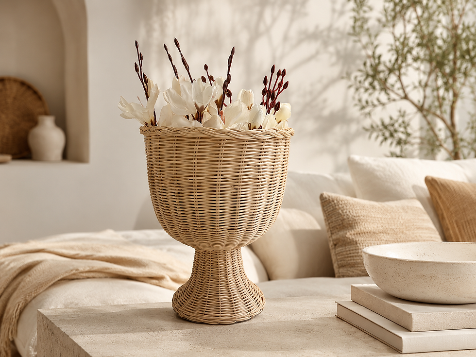
Shape does most of the work in a vase program. Color matters, but shape decides whether the piece feels useful in real rooms. A round body softens straight shelves. A tapered form adds height. A handled vase creates a relaxed coastal or Mediterranean feeling. A goblet shape lifts floral styling above the table surface.
Scale also needs clear separation. If three vases all sit within the same narrow height range, the group can look accidental. A stronger set may include one tall form, one medium rounded form, and one low accent piece. That mix gives a shelf or table better rhythm.
For tabletop styling, a medium woven vase pairs well with a tray and a low object. The tray defines the space. The low object keeps the base grounded. Meanwhile, the vase adds height. This simple three-part setup works on coffee tables, dining sideboards, and entry cabinets.
For shelf styling, height changes should stay visible. A vase can sit near upright books, but it should not match the book height exactly. A difference of 6 to 10 cm usually looks more natural. Also, stacked books or a woven tray can lift the vase when the display needs movement.
For floor styling, the outline should stay readable from across the room. A tall vase with a narrow neck can look elegant beside curtains. A wider handled vase may look better near a lounge chair. In both cases, the shape should make sense before any stems are added.
Round forms
Round woven vases bring softness. They work well when a shelf has many square lines, such as boxes, books, frames, and storage baskets. However, the vase still needs a clear rim or neck. Without that detail, a round vase can look too close to a small basket.
Tall forms
Tall woven vases give vertical movement. They help corners, consoles, and floor areas feel more finished. Meanwhile, tall forms also work with dried stems, branches, and slim artificial flowers. The opening should fit the styling plan, not fight it.
Handled forms
Handled woven vases add character quickly. A handle creates a loop, and that loop breaks up the body surface. In coastal, farmhouse, and Mediterranean interiors, this detail feels natural. However, the handle should not look oversized unless the design intentionally leans rustic.
Pairing vases with baskets, trays, and lighting
Woven vases become more useful when they connect with nearby categories. A vase alone can look attractive. However, a vase beside a basket, tray, and lamp tells a fuller home story. This matters for showroom layouts, online product pages, and seasonal decor planning.
Baskets give the display function. They can hold throws, towels, magazines, gift items, or small accessories. Meanwhile, vases add shape and height. Together, the scene feels balanced because one item works hard while the other creates atmosphere.
Trays help organize the surface. A tray under a vase, candle holder, and small object keeps the group from looking scattered. On a 60 cm coffee table, this makes a big difference. The display feels styled, yet it still leaves space for daily use.
Lighting brings out the weave. A table lamp beside a woven vase creates small shadows in the material. In evening settings, warm light can make natural rattan, water hyacinth, and woven surfaces feel richer. Also, pendant lights above dining tables can make a vase centerpiece feel softer.
Planters pair well too, especially when the vase line leans natural. A woven planter has a functional garden feeling, while a decorative vase feels more sculptural. Together, they can build a layered botanical story without relying on too many green plants.
For seasonal displays, pairing also keeps the vase fresh. In spring, woven vases can sit with pale florals and light trays. In autumn, they work with dried grasses, brown baskets, and darker candle holders. During holiday setups, natural ribbon, gift baskets, and warm lighting can change the mood without changing the core product.
Custom decorative directions for private label programs
Custom vase development should start with use, not decoration. A vase for shelf styling needs a clear front view. A floor vase needs a stronger outline. A floral vase needs a mouth opening that supports stems. Therefore, the design brief should define the scene before color or finish.
Finish direction comes next. Natural beige works across many rooms because it pairs with wood, linen, white ceramics, and soft neutrals. Meanwhile, honey brown feels warmer and more grounded. A whitewashed finish feels lighter and often suits coastal or farmhouse settings.
Two-tone finishes can make a vase stand out online. A natural body with a darker rim gives the image a stronger edge. A light base with a warmer upper section can add contrast without making the piece look busy. However, the weave should still remain visible after finishing.
Rim detail is another practical choice. A plain rim feels clean and modern. A ruffled or scalloped rim feels more decorative. A thicker wrapped rim looks stronger and can help the piece read better in close-up photos. Each rim choice changes the mood.
Weave density matters too. A dense weave feels neater and more refined. An open weave feels casual and airy. In a large vase, an open weave can reduce visual weight. In a small vase, a denser weave can help the piece look more finished.
For a private label program, the best line usually avoids too many special details in one item. A vase with a special rim, strong handle, mixed finish, and heavy texture may look confused. One or two strong details are enough. The rest should support the shape.
How a woven basket supplier supports vase assortments
A woven basket supplier understands structure, handfeel, edge finishing, and material behavior across many home decor forms. That background helps when developing vases because a decorative vessel still needs balance. It should look sculptural, but it also needs a steady base, clean rim, and reliable surface.
In a sourcing discussion, the strongest starting point is the room scene. A vase for a 5-tier shelf needs a different shape from a vase placed beside a sofa. A vase for dry stems also needs a different opening from a display-only vessel. These small details can decide whether the piece becomes useful or gets ignored.
Material choice also needs care. Rattan gives a classic woven look with clear lines. PP rattan can support certain decorative shapes and consistent finish directions. Water hyacinth often feels fuller and softer. Each material creates a different type of warmth.
Meanwhile, a supplier with basket experience can help connect categories. A vase can share tone with a storage basket, rim detail with a tray, or weave direction with a pendant lamp. These links make the whole collection feel planned. Without them, each SKU may look separate.
For a natural home decor program, this connection matters more than adding random new shapes. A stronger line uses fewer pieces but gives each one a clear job. That approach makes the assortment easier to style, photograph, pack, and present.
Use scenes that make woven vases more practical
Living rooms are the easiest place to use woven vases. A medium vase can sit on a coffee table with a tray and candle. A taller piece can stand beside a lounge chair or curtain. In both cases, the woven surface softens furniture lines.
Bedrooms need smaller and quieter pieces. A nightstand often has only 40 to 50 cm of width. Therefore, a compact vase with one stem works better than a wide decorative form. It adds texture without fighting the lamp, book, or small dish.
Dining rooms can use woven vases on sideboards and buffets. A goblet-shaped vase with faux flowers can lift the arrangement above plates and linens. Meanwhile, lower vases may suit the dining table itself because they do not block conversation.
Bathrooms need careful placement. A small woven vase can look good on a dry shelf with rolled towels and soap accessories. However, many woven materials do not like long exposure to moisture. For this reason, a dry shelf or covered vanity area is a better choice than a wet corner.
Entryways benefit from medium and large vases. A console table near the door usually needs a quick visual anchor. A woven vase with stems, a tray for keys, and a small lamp can make the area feel ready in seconds. The setup is simple, but it looks complete.
Hospitality spaces can use woven vases to warm up large surfaces. A resort villa, boutique lobby, spa desk, or café corner may have many hard materials. Woven texture softens that feeling. Also, larger pieces help fill space without adding a heavy sculptural object.
Sourcing checklist for decorative vase programs
A sourcing checklist keeps the vase program practical. Instead of starting with “natural style,” the brief should explain placement, material direction, finish family, and related categories. This makes development clearer from the first sample round.
Start with placement. Shelf vases, tabletop vases, console vases, and floor vases all need different proportions. A vase meant for a shelf should not need a large floor scene to look good. Likewise, a floor vase should not depend on tiny close-up details.
Next, define the styling function. Some woven vases need to hold dry stems or faux flowers. Others only need to stand as sculptural decor. The opening, neck height, and body balance should follow that function.
After that, check finish direction. Natural, whitewashed, honey brown, dark brown, and two-tone finishes all support different interiors. However, the finish should not cover the woven texture completely. If the surface becomes too flat, the vase loses its main value.
Packing should come into the discussion early. A vase with handles, a ruffled rim, or a pedestal base may need extra protection. The carton should limit movement and protect pressure points. Even a beautiful vase can lose value if the rim arrives bent or rubbed.
Documentation also helps. A clear product page should show a front view, detail view, styled scene, and packing view when possible. In a 4-image layout, those angles answer more questions than four similar beauty shots.
Sourcing Checklist
Define the main scene: shelf, tabletop, console, floor, hospitality, or seasonal display.
Select 3 to 5 core shapes instead of many similar silhouettes.
Add one small accent vase, one medium tabletop piece, and one stronger statement form.
Check rim detail, neck opening, body balance, handle placement, and base stability.
Review the finish under daylight and warm indoor lighting.
Pair each vase with baskets, trays, lamps, planters, or decorative objects.
Confirm whether the vase supports dry stems, faux stems, or display-only styling.
Plan inner protection for rims, handles, pedestal bases, and wider body sections.
Prepare product images for front view, detail view, room scene, and carton protection.
Use the woven decorative vases category as the main internal link for vase-related sourcing content.
Comparison Table
Vase direction | Best fit | Main benefit | Pairing idea | Selection thought |
Round woven vase | Shelves, consoles, living rooms | Softens straight furniture lines | Books, trays, small baskets | Choose a visible rim or neck detail |
Double-handle woven vase | Entry areas, floor corners, coastal rooms | Adds character and width | Table lamp, large basket, dry stems | Keep handles balanced with body size |
Goblet-style woven vase | Dining tables, sideboards, floral scenes | Adds height with a raised base | Faux flowers, candle holders, placemats | Check the base and opening together |
Vase trio | Shelf stories, online styling, seasonal displays | Builds rhythm through size changes | Small trays, books, lighting | Avoid three pieces with nearly equal height |
Tall tapered vase | Corners, bedrooms, hospitality spaces | Creates vertical movement | Floor basket, lounge chair, branch stems | Make sure the base feels steady |
Wide-mouth woven vase | Casual tabletops, farmhouse displays | Feels open and relaxed | Dried grass, linen runner, low bowl | Use when fuller stem styling is planned |
Shape selection: what gets noticed and what gets skipped
Some vase shapes look interesting in a catalog but feel hard to place in real rooms. A very unusual profile can work for one photo, yet struggle across many shelves. Therefore, a vase line should include memorable shapes without making every item a statement piece.
Round forms get noticed because they soften hard lines. They sit well against square shelves, rectangular trays, and stacked books. However, the round body needs a clear top detail. A defined rim, narrow neck, or small raised foot can make it read as a vase instead of a basket.
Tall forms work when the space needs height. A corner beside curtains, a blank sideboard area, or a wide entry table can all use vertical movement. Still, the opening must match the styling plan. A wide opening needs fuller stems, while a narrow one suits single branches.
Handled forms are useful when the theme needs warmth. Mediterranean, rustic, coastal, and farmhouse scenes often benefit from that detail. Meanwhile, the handle gives the product a stronger outline in thumbnail images. That matters for online browsing.
Goblet shapes bring a different effect. They lift flowers or decorative stems above the table surface. This can make a dining setup look more finished. Also, the raised base helps the vase stand apart from trays, plates, and other low accessories.
Sets need more discipline. A trio should not look like three random leftovers. A useful set has clear size changes, related materials, and one shared design cue. That cue might be a rim style, body curve, or weave direction.
Material and finish choices for natural interiors
Material choice changes the feeling of the vase before any styling begins. Rattan often feels clean, familiar, and structured. It works well with light wood furniture, linen fabric, cream walls, and soft neutral accessories.
Water hyacinth feels fuller and more organic. Its surface can look chunkier and warmer. Therefore, it suits relaxed interiors, resort-style rooms, and displays with heavier woven texture. However, it may feel less formal than a tighter rattan weave.
PP rattan can support decorative shapes and consistent color direction. It may work well when a program needs a steady finish across repeat orders. Still, the design should keep enough woven detail visible. A plain shape with a flat finish can lose the handmade feeling.
Seagrass and plantain leaf can create a more rustic look. These materials often feel casual, soft, and slightly irregular. In a farmhouse or natural resort scene, that irregularity can be part of the charm. In a clean modern setting, it should be used with restraint.
Finish direction should stay close to the room story. Natural beige suits year-round displays. Whitewashed tones feel coastal and light. Honey brown feels warmer and richer. Darker brown can add depth, especially beside cream walls or pale furniture.
However, too many finishes can weaken the category. A vase page with eight unrelated colors may feel messy. A tighter range of two or three finish families often looks stronger. It also makes product photography and shelf planning easier.
Styling ideas for shelves, consoles, and floor areas
Shelf styling needs rhythm. A shelf full of items at the same height looks stiff. Therefore, a woven vase should sit at a slightly different level from books, baskets, and framed art. A 6 cm height difference can change the whole shelf.
On a bookcase, a small vase can sit beside horizontal books. A framed print can stand behind it. Meanwhile, a low woven tray can hold a candle or small object nearby. The group feels layered without becoming busy.
Console styling needs a stronger center or side anchor. A medium woven vase can sit on one side, while a lamp balances the other. Between them, a tray can hold keys, fragrance, or a small bowl. This setup works well near doors because it looks useful and styled.
Dining sideboards can handle taller pieces. A goblet vase with faux flowers can sit beside table linens and candle holders. However, the arrangement should not block storage doors or serving space. Practical movement still matters.
Floor styling needs breathing room. A large woven vase should not squeeze between furniture legs. It needs a visible area around it, often near curtains, chairs, or an empty corner. Add dry branches only if the vase already has enough base strength.
For window displays, use depth. A tall vase can sit toward the back. A medium vase can sit in the middle. A small accent can sit near the front. This simple front-to-back movement helps the display look fuller from the walkway.
How sets can support stronger shelf stories
Vase sets work when they solve a styling problem. A single vase may look lonely on a wide shelf. A set can fill the space without needing many unrelated accessories. However, the pieces must not fight each other.
A good set usually has three levels. One tall piece creates height. One medium piece creates body. One low piece grounds the group. Together, they create movement. A shelf can then use fewer props and still feel complete.
Color should stay calm in a set. Natural, honey, and light brown can work together. Meanwhile, one darker rim or one whitewashed accent can add contrast. But if every piece has a different finish, the set starts to feel random.
Shape relation matters as well. A trio can share the same rim style, weave direction, or curved body line. This makes the group feel related even when the sizes change. Without that shared detail, a set may look like three separate samples.
Sets also help with room styling. One piece can move to a side table. Another can stay on the shelf. The third can sit on a tray. This flexibility makes the group more useful across apartment, villa, and showroom scenes.
Packaging and protection for woven decorative vases
Decorative vases often have pressure points. A round body touches packing at its widest area. A handle can rub against the carton. A ruffled rim may catch on inner material. Therefore, packaging should protect the parts that make the piece attractive.
Rims need careful attention because they are visible immediately. A bent or flattened rim can make the vase look tired before it reaches the display. Handles need side spacing, especially when they extend beyond the body. Bases also matter because a vase must stand neatly.
Inner protection should stop movement without crushing the weave. A carton that is too loose allows rubbing. A carton that is too tight presses the surface. The better choice is stable support around key points.
Nested packing may work for some open shapes. However, it should not deform the rim or leave pressure marks. For shaped vases, separate protection may be safer. The right method depends on body width, neck shape, and material strength.
Packing photos can also support product pages. A simple carton protection image is not glamorous, but it answers a real sourcing question. It shows how the piece travels from warehouse handling to shelf display.
Common mistakes to avoid in vase programs
One common mistake is adding too many similar shapes. Five beige vases with small size changes do not create a strong program. Instead, the line needs clear roles. One round piece, one tall piece, one handled piece, and one set can often do more.
Another mistake is ignoring the mouth opening. A decorative vase may look good empty, but many displays add stems. If the opening is too wide, a single stem falls flat. If it is too narrow, fuller florals look cramped.
A third mistake is overdecorating the surface. Pattern, color, handle, rim, and mixed weave can all be useful. However, using every detail at once can make the piece hard to place. Strong design usually leaves some space for the room around it.
Poor scale planning can also weaken the assortment. A small vase may disappear on a wide console. A large floor vase may overpower a compact apartment scene. Therefore, each SKU should have a target placement before sampling.
The last mistake is treating packaging as an afterthought. A vase can look perfect in the sample room and still fail if the rim or handle receives no protection. Practical packing protects both the product and the visual impression.
How to brief a woven vase program clearly
A strong brief starts with a scene. For example, “entry console with lamp and tray” gives more direction than “natural vase.” It tells the design team the rough height, surface use, and styling mood. That small detail saves time.
Next, the brief should define the material feeling. A clean rattan look, a fuller water hyacinth feel, and a light PP rattan direction all lead to different results. A simple material mood board can help keep the program focused.
Then, the brief should explain finish limits. If the line needs warm beige and honey brown, say that early. If whitewashed finishes should stay soft and not chalky, include a reference. Clear limits reduce guesswork.
A good brief should also mention what not to do. Avoid oversized handles if the style is modern. Avoid glossy finish if the collection is natural. Avoid very rough texture if the product will sit near bedding or towels. These limits are useful, not negative.
Finally, the brief should include packing expectations. If the program includes ruffled rims, handles, or pedestal bases, those features need protection. This detail should not wait until the final order stage.
For a wider natural home decor plan, woven decorative vases can connect with baskets, trays, lighting, and planters. This keeps the material story consistent across rooms and product groups.
FAQ
Strong CTA for custom woven decorative vase collections
A useful vase program should feel calm, practical, and easy to style. It should not depend on one perfect photo. Instead, each piece should have a clear place on a shelf, console, tabletop, floor corner, or hospitality scene.
For a more complete natural decor line, connect vases with baskets, trays, lighting, planters, and decorative objects. This makes the assortment easier to present and easier to expand. It also keeps the visual language consistent across rooms.
To develop a more focused program, start with three actions:
Choose the core scene first: shelf, console, tabletop, floor, or hospitality display.
Build a useful shape group: round, tapered, handled, goblet, and vase trio.
Ask Goldwoven for customization for woven decorative vase collections, including shape, finish, rim detail, weave direction, and protective packing.
For custom sourcing and collection planning, work with a woven basket supplier that can connect woven vases with wider natural home decor categories.